TPCC Brand Kit
For Staff and Third Party Affiliates
v 1.0 // August 2026
Your Connection Point is the fastest way to get engaged at Turning Point.
Find the calendar, announcements, giving, connection cards, and the evergreen links you need without searching the whole website.
Go to Connection Point















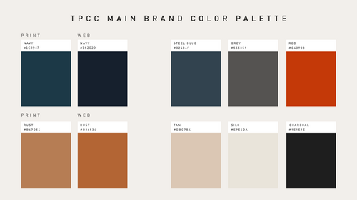
Color is one of the fastest ways people recognize the TPCC brand. Our signature palette creates consistency, builds familiarity, and communicates the warmth, confidence, and energy of our church.
The TPCC color palette is built around Navy and Orange, which should be the dominant colors in both print and digital applications. Secondary colors are intended to add depth and variety without competing with the primary palette, while neutral colors create space, improve readability, and provide balance. Use accent colors intentionally to draw attention to key information, calls to action, or moments of emphasis.













The topographic pattern is a signature visual element of the TPCC brand. It reinforces the mapping and directional language found throughout our identity system and should be used to support—not overpower—the message of a design.
For unique campaigns, ministries, or special projects, alternate topographic map patterns may be purchased and used when appropriate. Any new pattern should clearly reflect authentic topographic linework and must be reviewed and approved by the Design Team before implementation.
Color:
The Navy pattern is the primary and most commonly used version throughout the TPCC brand system.Guides:










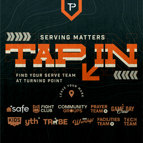
Access the current sermon series graphics, including approved assets for digital, print, presentations, and ministry promotions.

Find approved generic graphics for Sunday services, events, and church-wide announcements that can be customized for your ministry or communication needs.

Need a ministry stamp logo?
Use this template when creating a ministry stamp logo. Once complete, send it to the Design Team for review and approval to ensure it aligns with TPCC brand standards.
Browse approved TPCC-branded graphics for social media, Sunday services, events, and other church communications.